CLIENT :
Lingua T

Belgium
PROJECT:
LOGO & WEB REDESIGN
BRAND IDENTITY | WEB ARCHITECTURE & DESIGN | WEB DEVELOPMENT
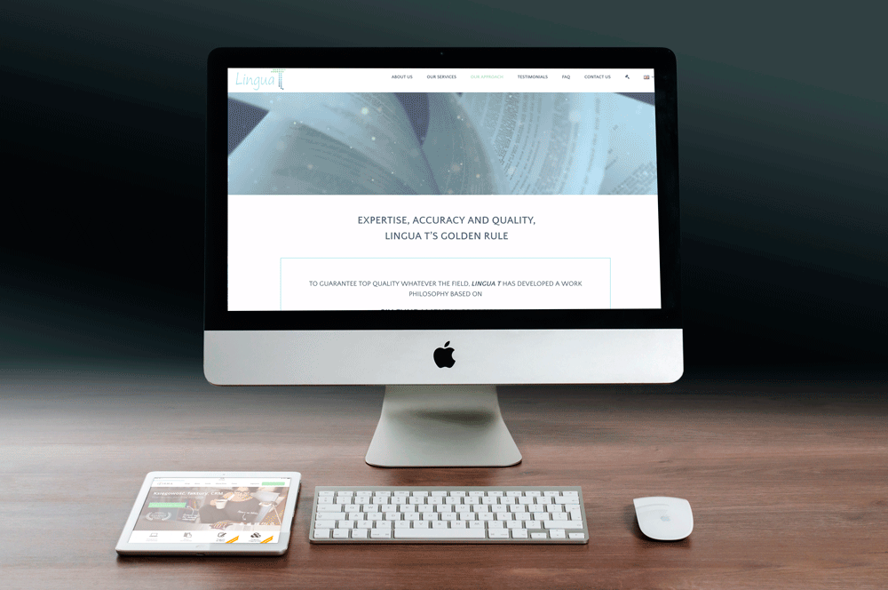
Lingua T is a translation company with a track record for excellence and clients as renowned as the European Commission and European Bank.
They requested our help modernising their brand and their website. In particular, they wanted a platform that would reflect professionalism, calm and peace-of-mind.
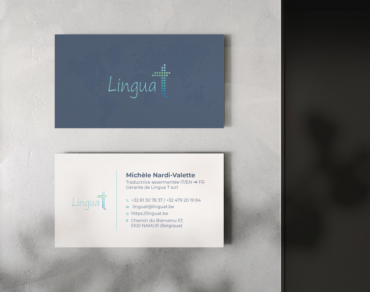
CORPORATE IDENTITY
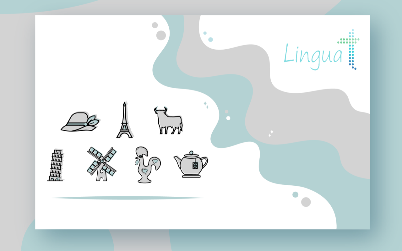
To provide Lingua T with a fresh identity without disrupting the existing brand recognition and equity, we kept the initial structure of the logo but redefined the colour tones for brighter variations, simplified the lines and created an ad-hoc typography for the name. We also designed a line of iconographies related to the languages proposed. Finally, we created new elegant and classy business cards.
WEB DESIGN
For the new website with a completely new design which highlighted our client’s professionalism and perfectionism with a clean and kind look, proprietary icons and graphs as well as general refined graphic elements. The new website also included a detailed form for direct online quotation requests.