Visual identity
We were approached by Brado, a new barber shop in Torino, Italy, with a request to help build their brand from scratch, defining an identity that would separate them from the rest and fully represent the owner.
The brief requested a bold, distinctive and modern image with a slight reference to the 80s combined with a manly contemporary feel.
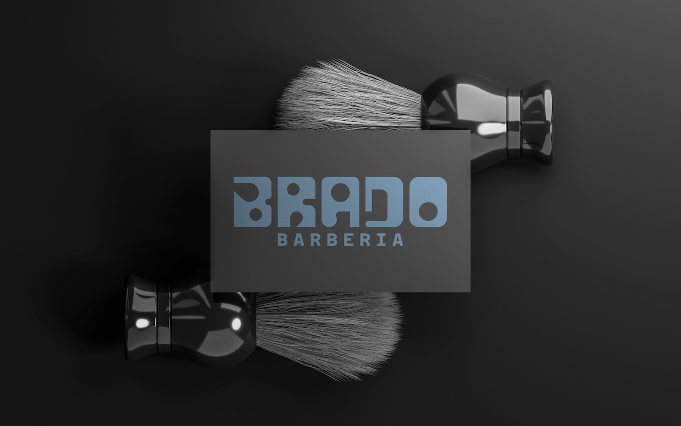
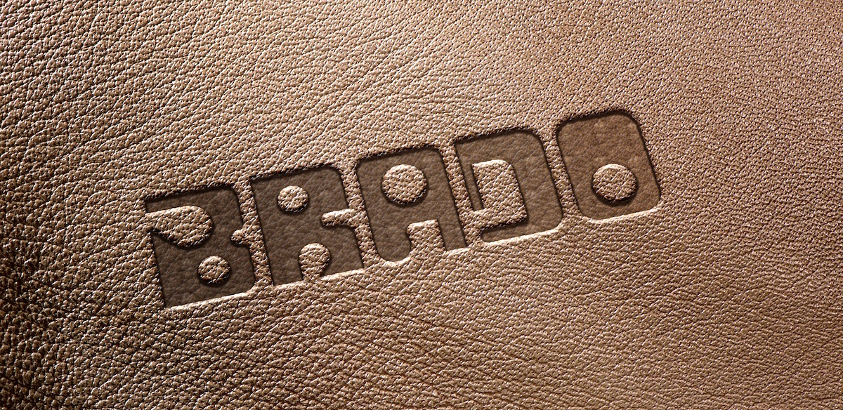
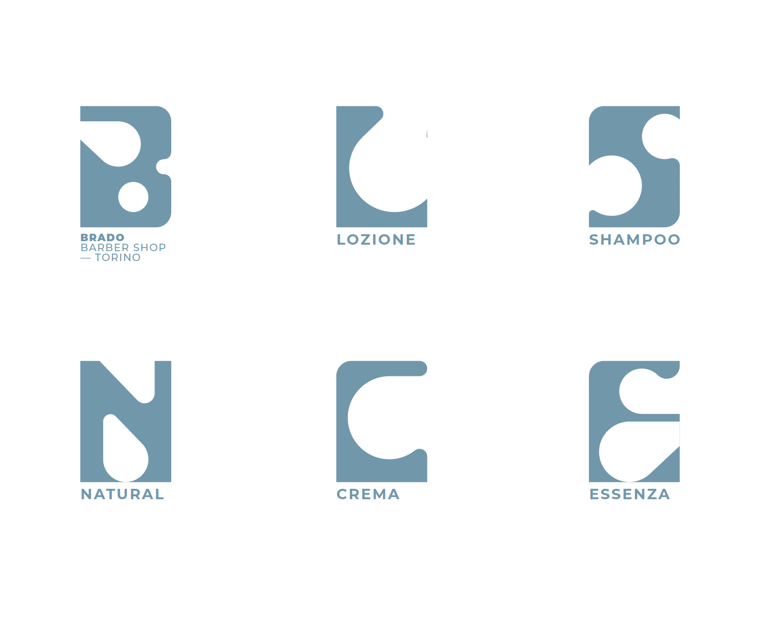
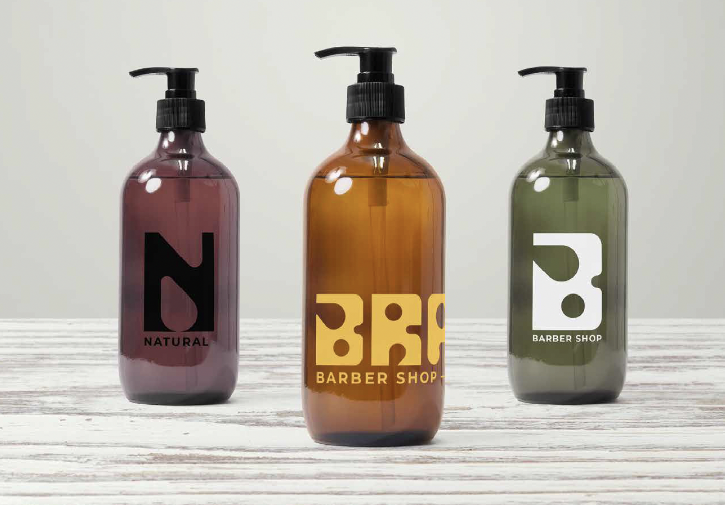
We took inspiration from the old style razor blades which showed geometric shapes where it locked with the razor. We then built an ad-hoc typography where each letter of the brand’s name is custom designed to look like razor blades. As such, each letter in itself becomes a distinctive graphic universe that can be used to brand products or merchandising.
