01. Intro
The brief
02. El reto
Creación de marca turística
Creating a brand with meaning
We traveled to Cáceres to dive deep into the spirit of the destination and led a series of interviews with members of the Diputación involved with the Tourism Department. These conversations revealed emotions that we used in the design of our brand, making sure that every elements has its own meaning, unique to Cáceres.

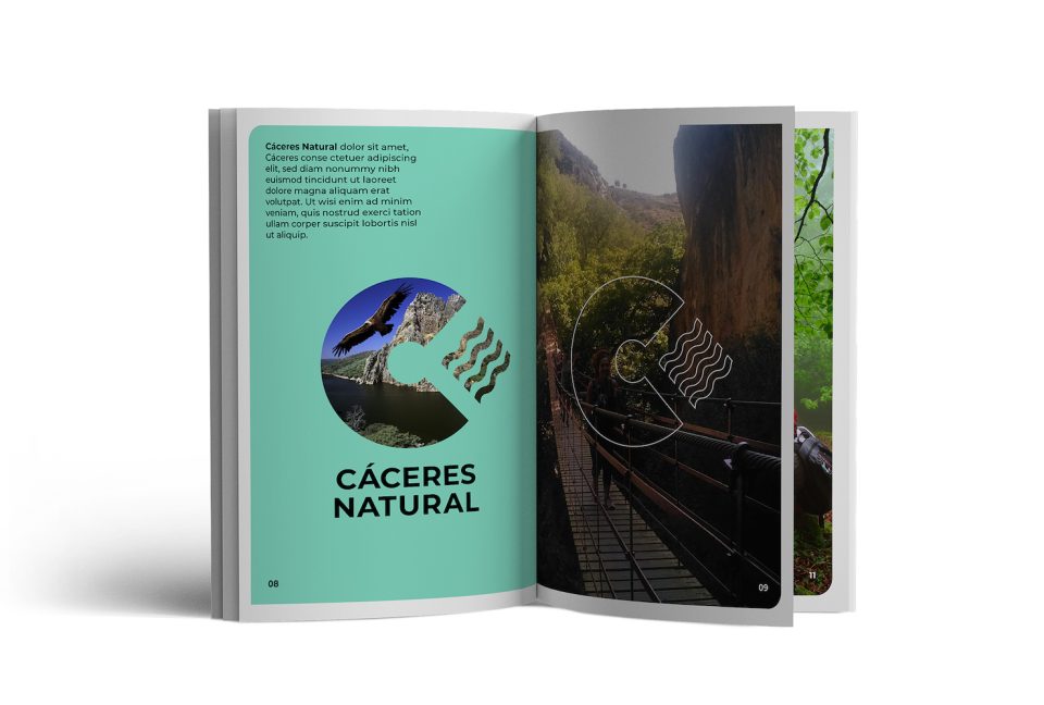
Logotype
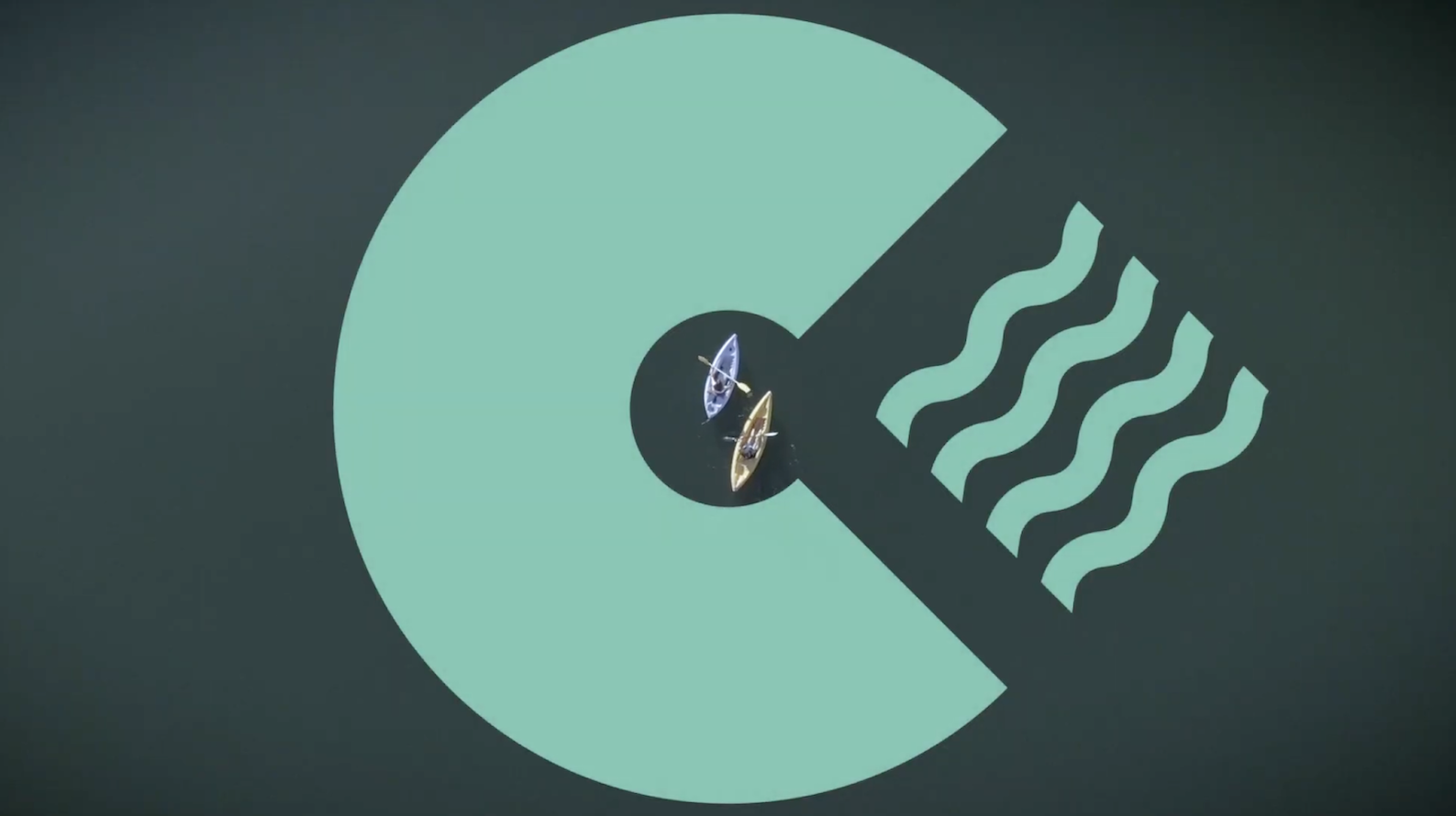
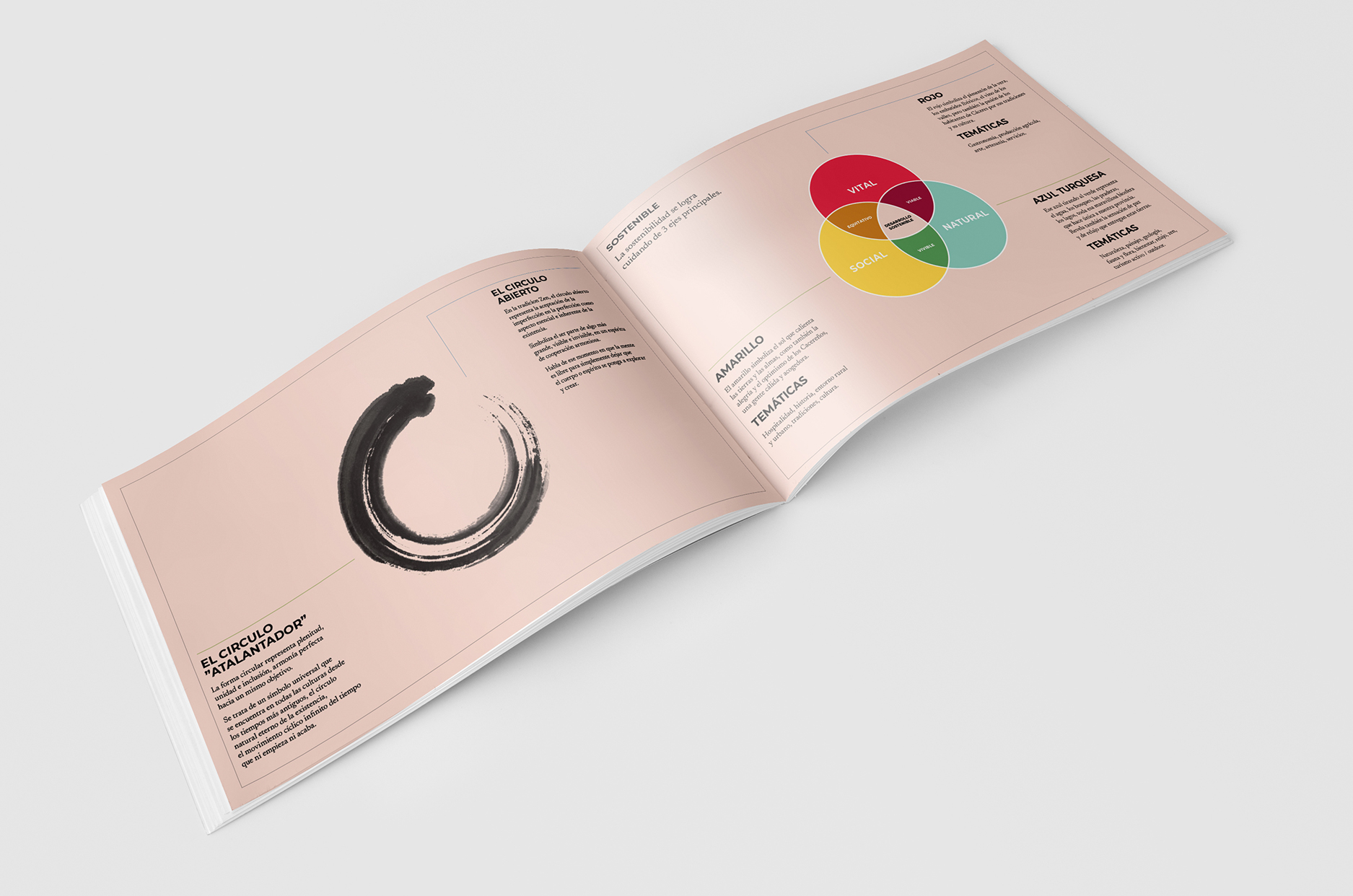
The custom typography is inspired from the shapes that can we found in the Province’s natural and architectonic elements. The open circle, symbol of connection with what is greater in the Zen philosophy, not only represents the letter “C” but is the building block of the entire font. Every letter flows into the next, until the “S” which is turned on its side to remind the “infinity” symbol, signifying the constant relationship between nature, patrimony and commerce, the 3 pillars of sustainability highlighted through symbols and colours.
Slogan
Brand Guideline
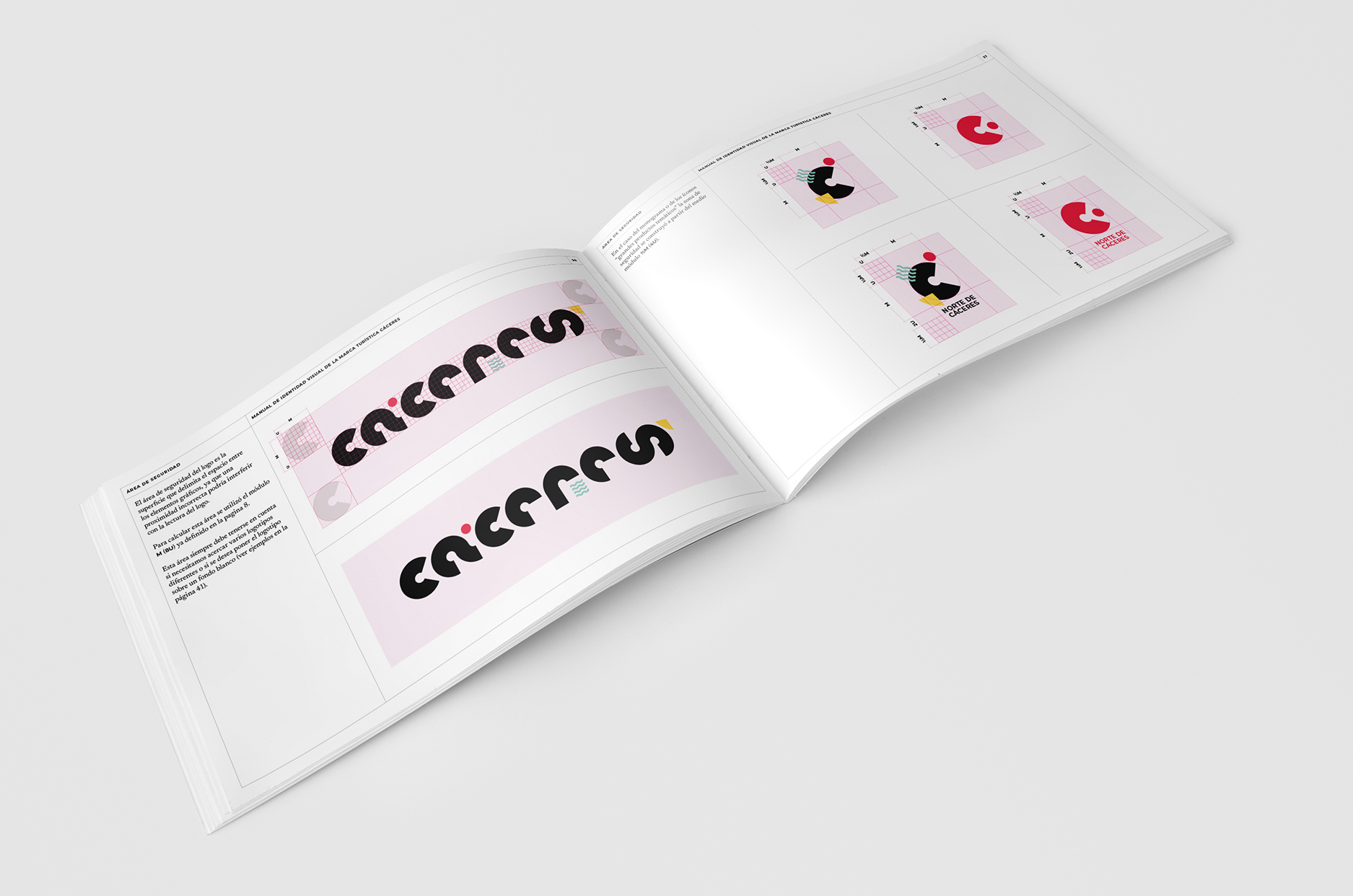
The brand structure was conceived to simplify its utilization across various formats and platforms, both physical and online, catering to a diverse range of stakeholders.
It allows for versatile adaptation without compromising its essence, offering versions in color and monochrome, in white or black, in both complete and reduced forms.
Maintaining a clear segmentation of products and territories within a visually and thematically coherent framework is a key aspect.
Moreover, the structure is designed to facilitate the seamless coexistence with other brands or institutional elements.
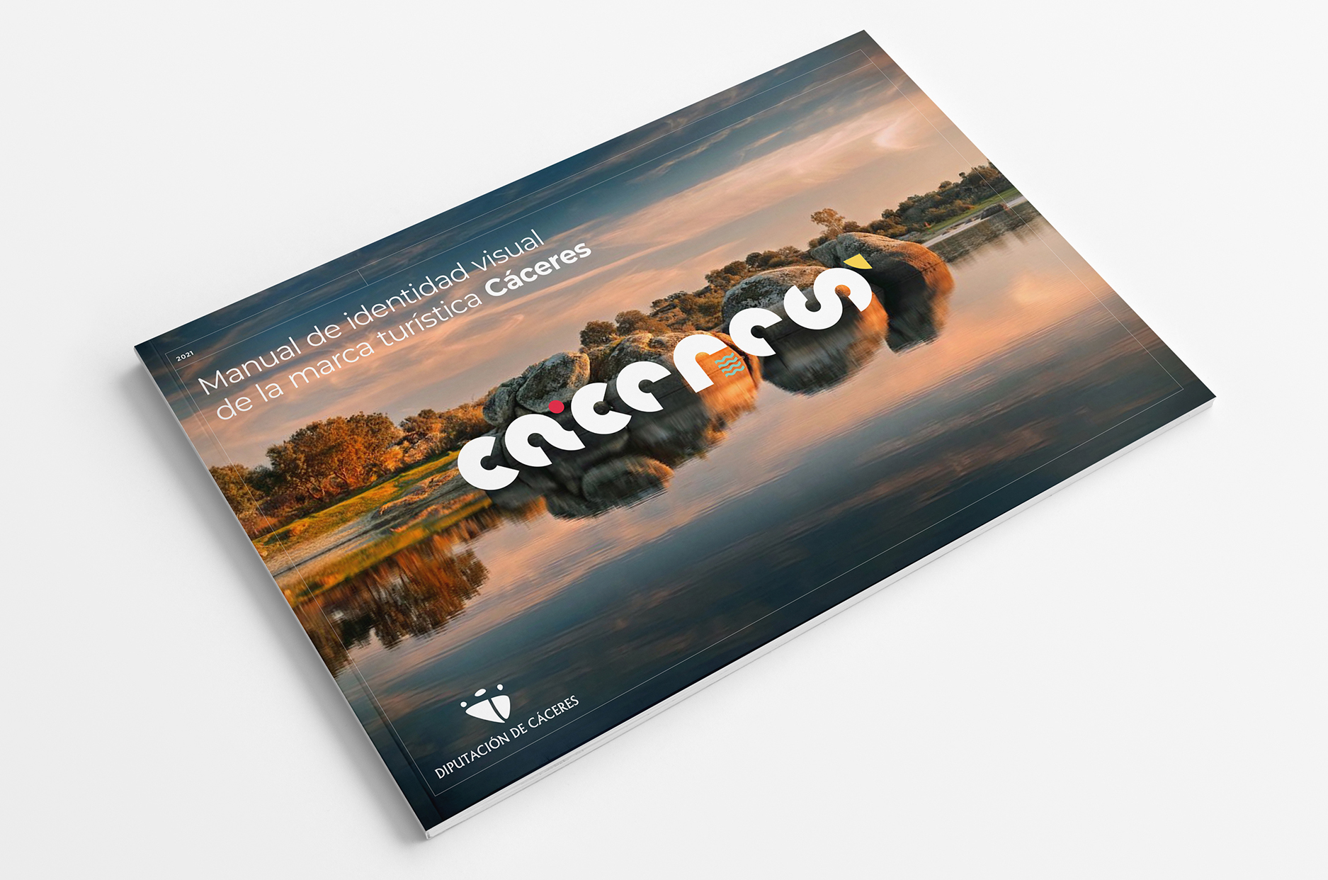
Manual de marca turística Cáceres
Manual de marca Cáceres
Manual de marca turística Cáceres 2
03. Brand Launch
Communication strategy
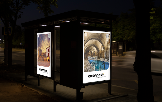
Once the visual identity is complete, it’s all about the reveal. We devised a 1-year launch strategy that considered all channels and target audiences, both national and international.
The strategy contemplated a first phase focused on the actors of the tourism sectors from hospitality to producers, followed by full B2C deployment on digital and traditional platforms at international level.
Estrategia de lanzamiento marca turística Cáceres
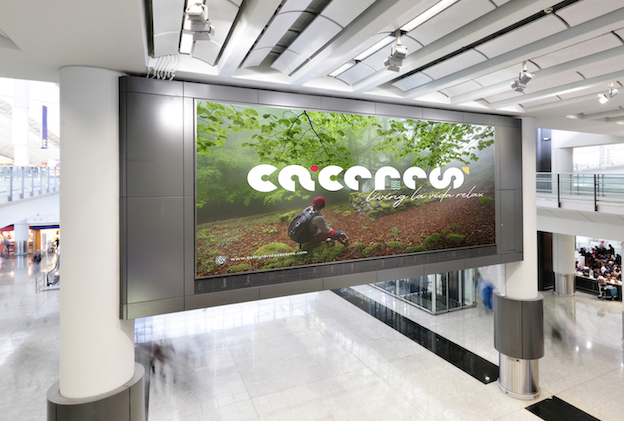
outdoor_airport
Marca turística Provincia de Cáceres
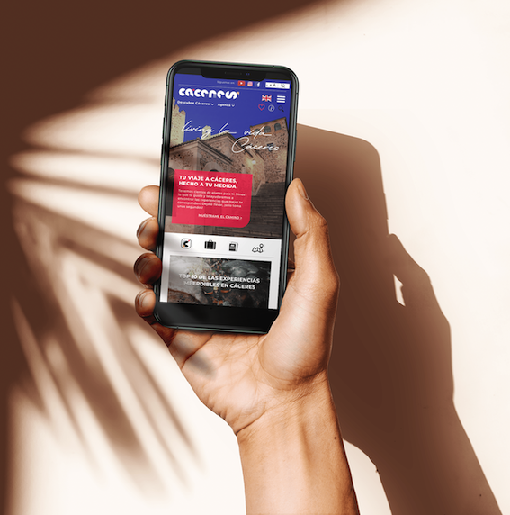
04. Web & APP
Content Strategy
We developed the architecture and content strategy for the province’s tourism both B2B and B2C websites as well as the APP to be developed for future visitors.

Estrategia contenidos web turismo Cáceres
Estrategia contenidos APP turismo Cáceres

Digital tablet screen mockup
Business people brainstorming in a meeting