CÁCERES PROVINCE
Cáceres, Spain
CREATION OF A NEW TOURISM BRAND
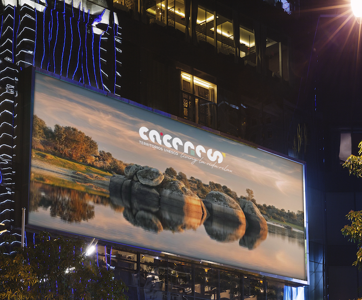
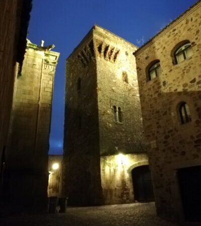
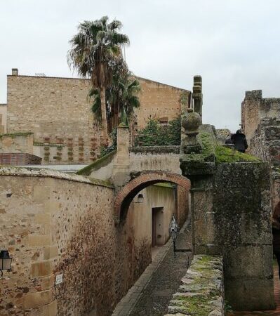
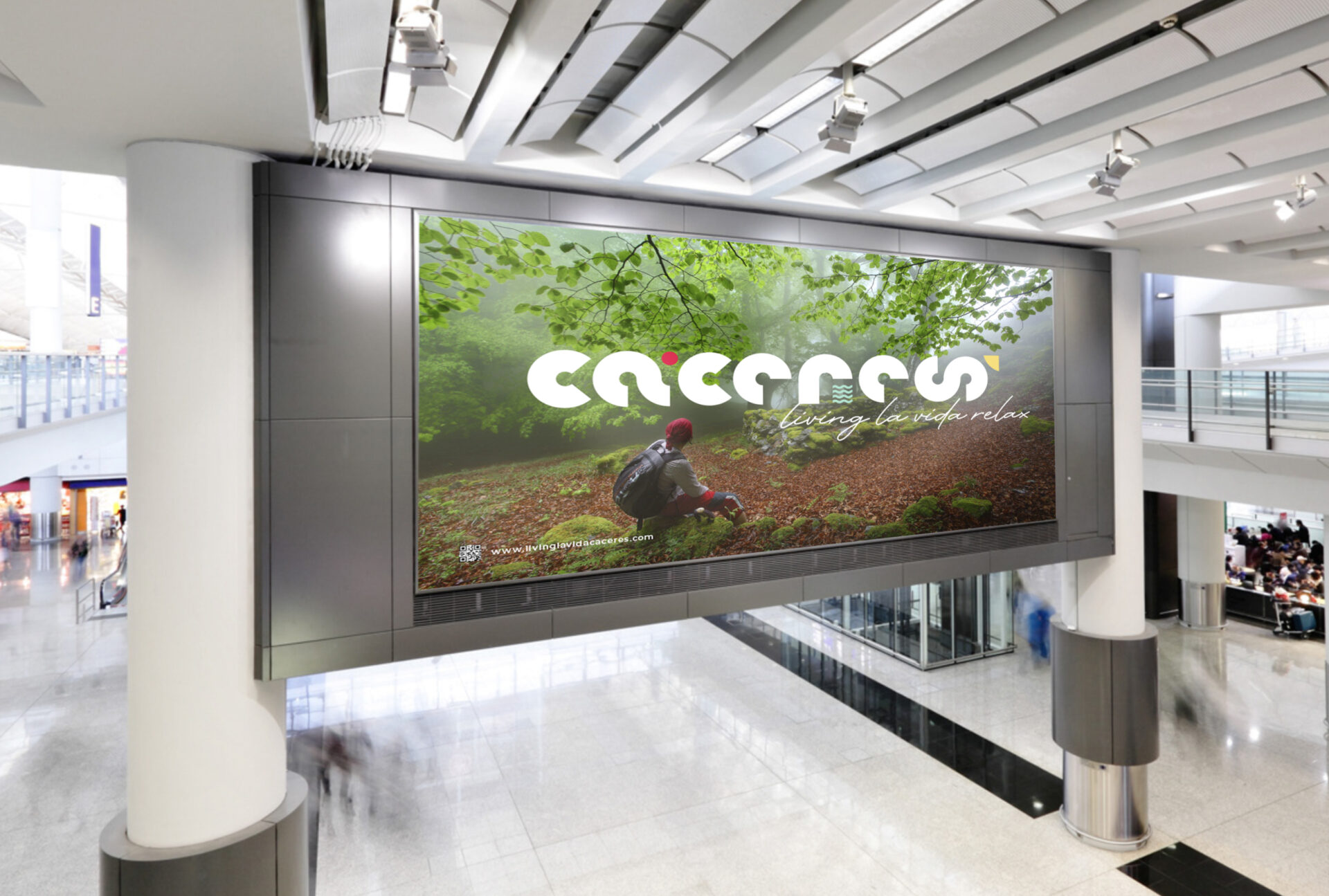
Cáceres is a Spanish province at the border with Portugal which had long been “forgotten” and in many ways misunderstood. Anxious to change this image of “lost land” and to boost tourism in the province, they commissioned Mila Branders to create a tourism brand that would be able to propel them on the national and international scene and attract new visitors.
CREATING A BRAND WITH MEANING
We traveled to Cáceres to dive deep into the spirit of the destination and led a series of interviews with members of the Diputación involved with the Tourism Department. These conversations revealed emotions that we used in the design of our brand, making sure that every elements has its own meaning, unique to Cáceres.

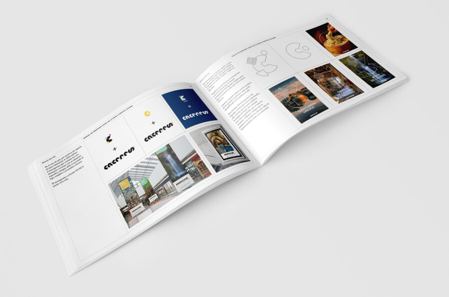
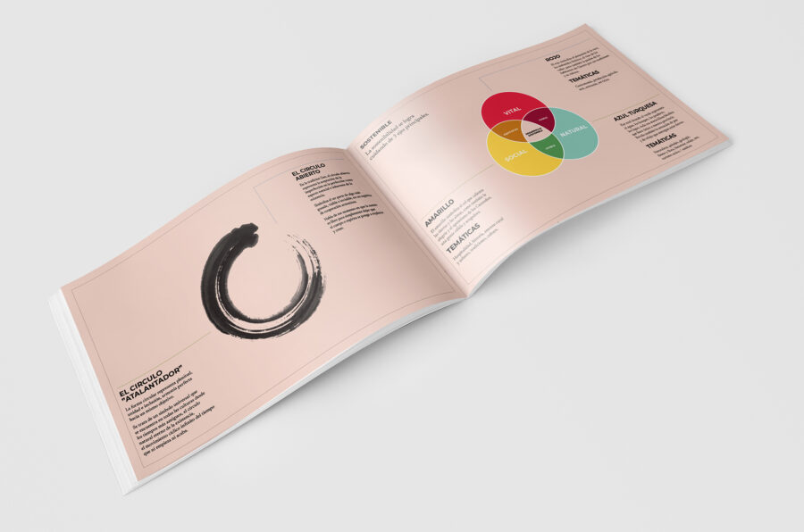
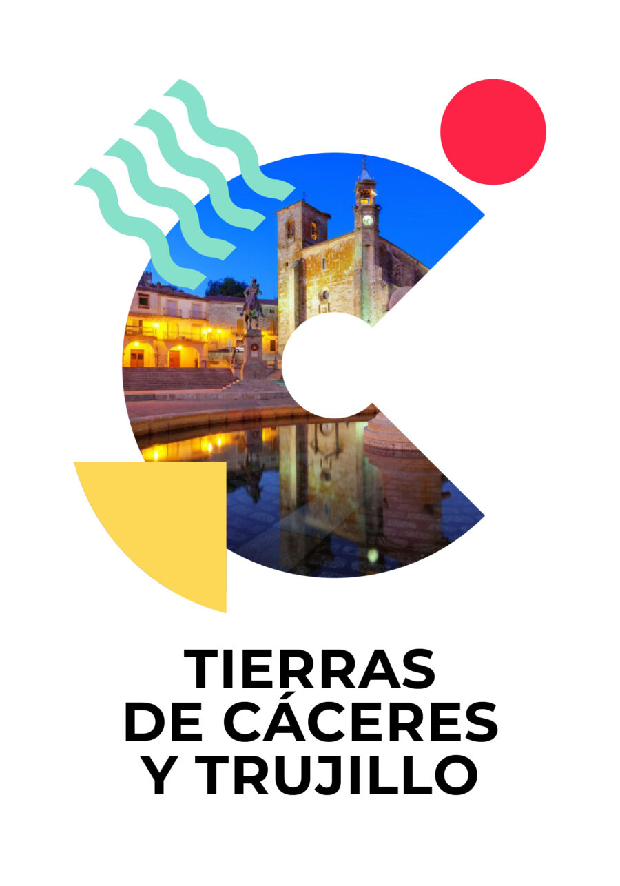
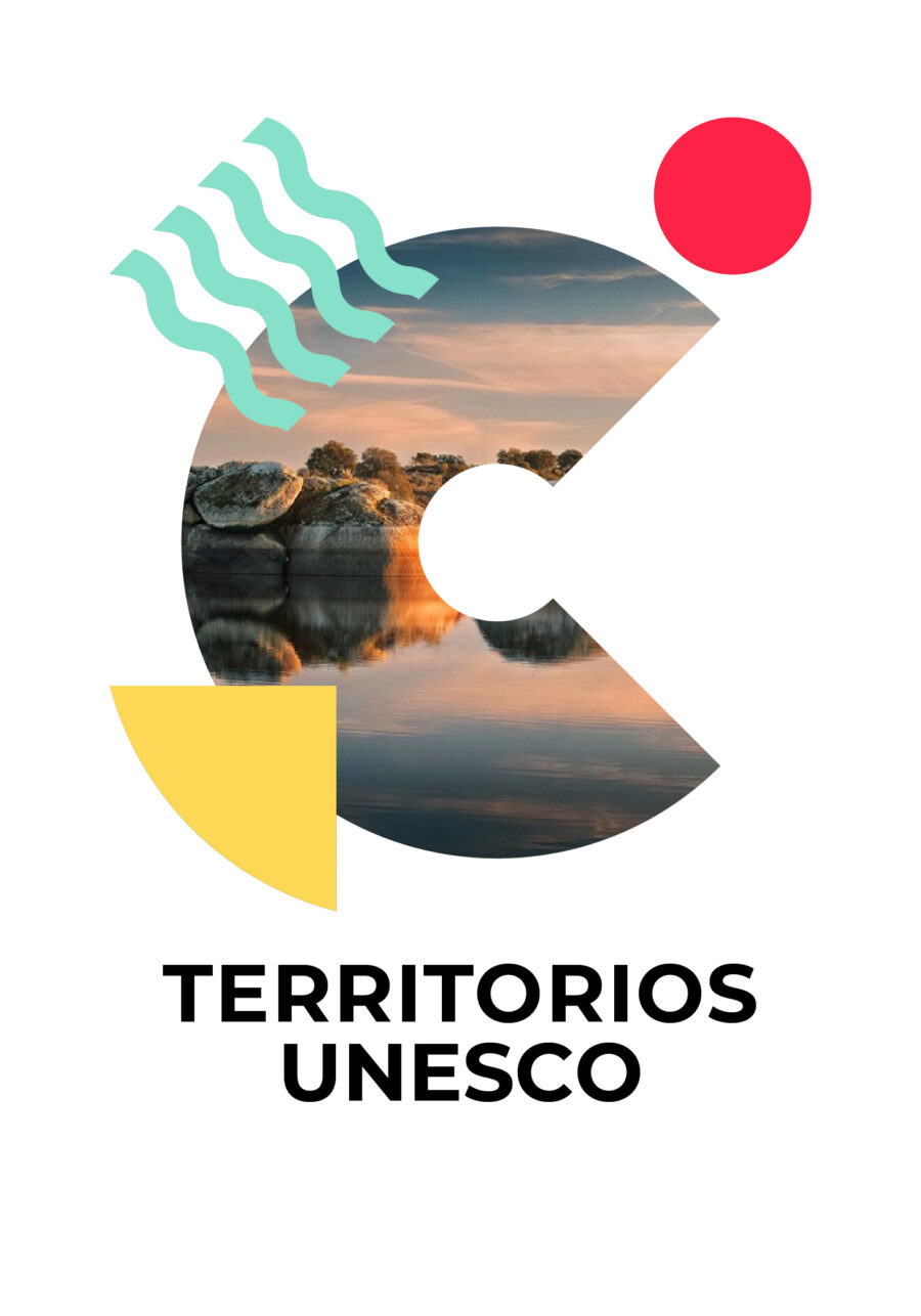
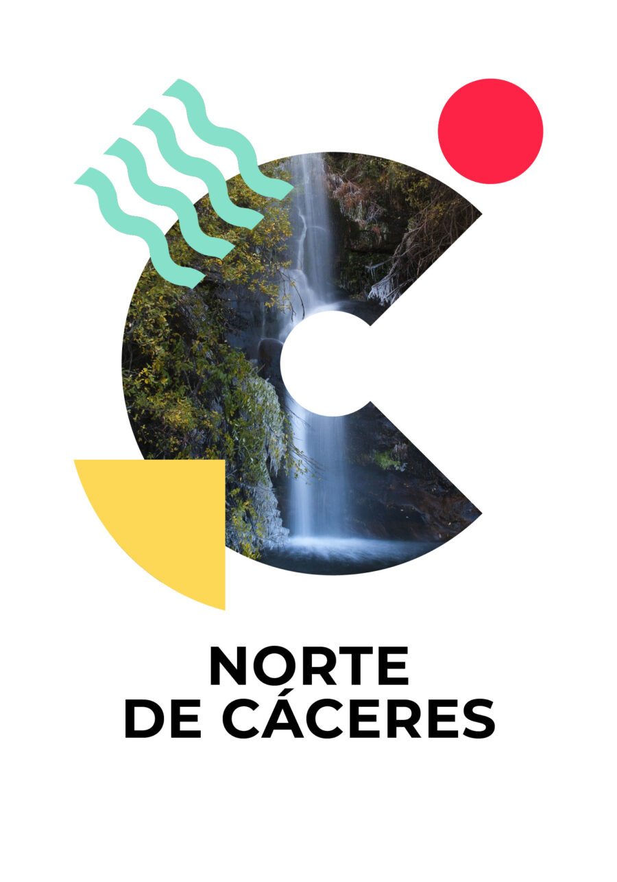
The custom typography is inspired from the shapes that can we found in the Province’s natural and architectonic elements. The open circle, symbol of connection with what is greater in the Zen philosophy, not only represents the letter “C” but is the building block of the entire font. Every letter flows into the next, until the “S” which is turned on its side to remind the “infinity” symbol, signifying the constant relationship between nature, patrimony and commerce, the 3 pillars of sustainability highlighted through symbols and colours.

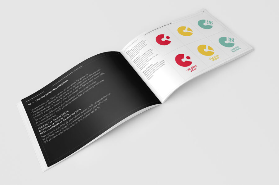
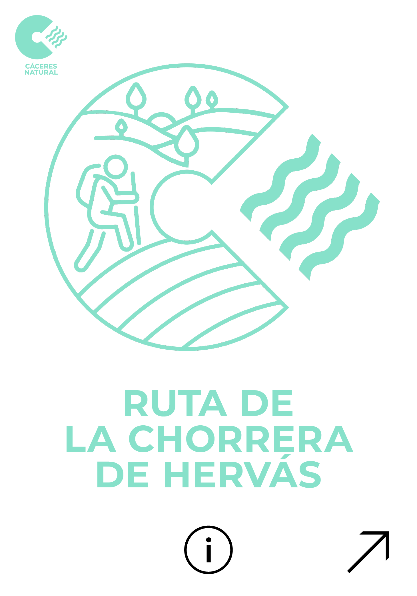
Cáceres Natural:
the turquoise waves represent the luxurious rivers and hills of the Province

Cáceres Social:
the warm yellow triangle comes to complete the circle just like the visitor is welcomed by the inhabitants of Cáceres into their land.

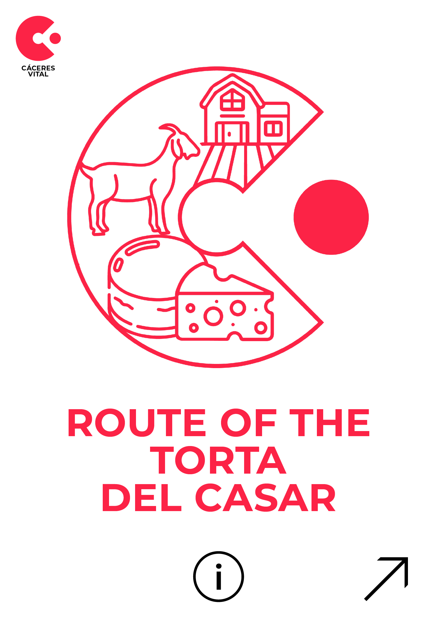
Cáceres Vital:
the circle, born from the very heart of the “C”, represents all that Cáceres offers to the visitors. The red is that of the paprika made in La Vera, of the rich local wines, of the Iberic pork products…
REDUCED LOGO & DECLINATION FOR PRODUCTS
The logo was declined into a “reduced” version to be used in small spaces such as social media platforms and other digital supports. This monogram version puts the accent on the 3 symbols of sustainability, while keeping the “C” of Cáceres to ensure the easy recognition and association with the name.
The reduced version of the logo with its related icon and colour is used for the individual products and sub-products.
BRAND LAUNCH COMMUNICATION STRATEGY
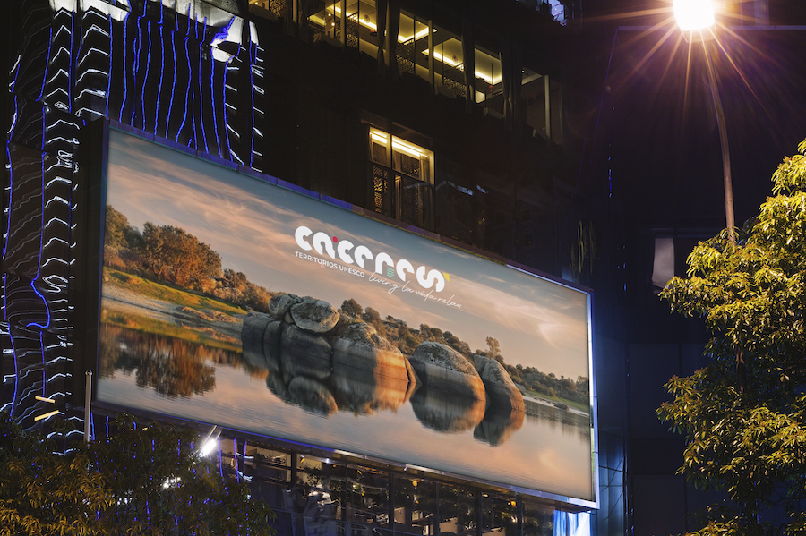
Once the visual identity is complete, it’s all about the reveal. We devised a 1-year launch strategy that considered all channels and target audiences, both national and international. The strategy contemplated a first phase focused on the actors of the tourism sectors from hospitality to producers, followed by full B2C deployment on digital and traditional platforms at international level.

WEB CONTENTS STRATEGY
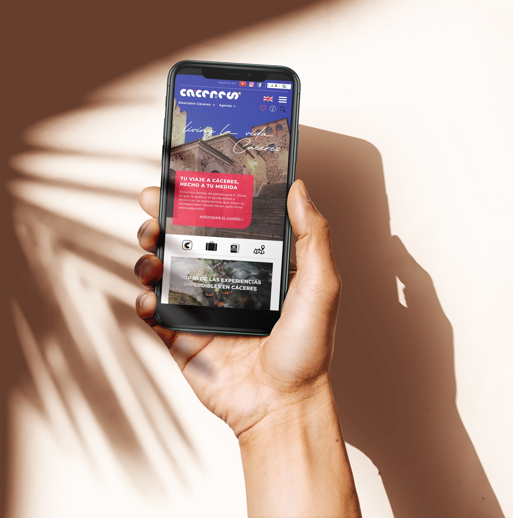
We developed the architecture and content strategy for the province’s tourism both B2B and B2C websites as well as the APP to be developed for future visitors.


