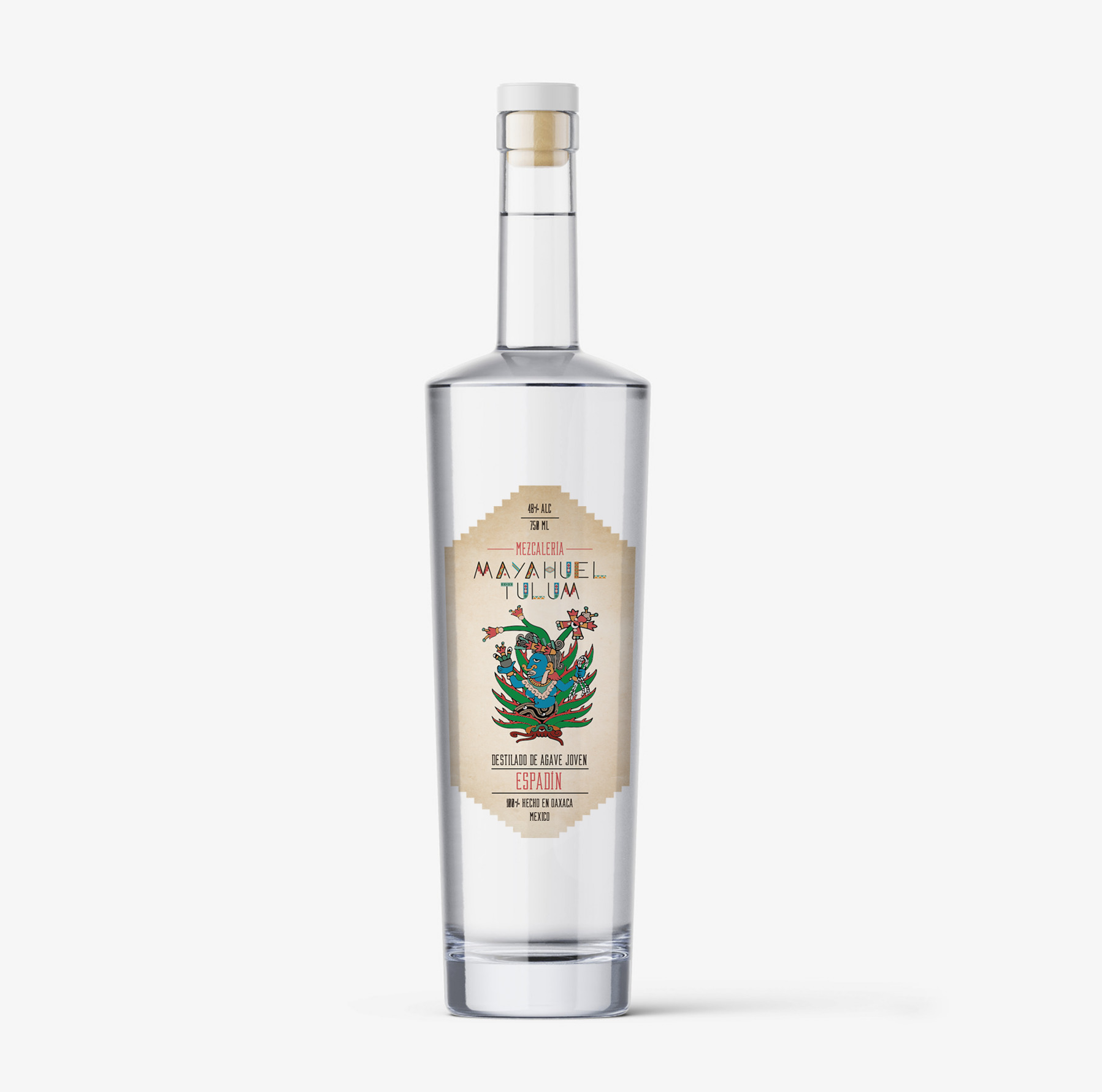
MAYAHUEL TULUM
MAYAHUEL Aldea Zama, Mexico LABEL DESIGN This delicious mezcal is crafted by the Mezcaleria Mayahuel Tulum in Aldea Zama, México....
EDIFICAT
CLIENT: INTERREG POCTEFA EDIFICAT Spain + France PROJECT: TRANSBORDER WEB & COMMUNICATION STRATEGY STRATEGY | WEB DESIGN | COMMUNICATION CAMPAIGN...
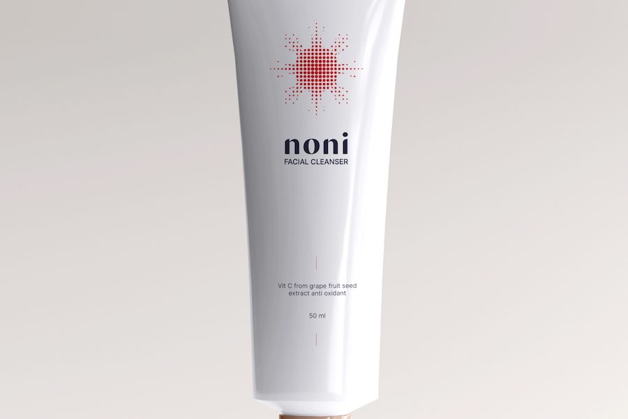
NONI COSMETICS
NONI COSMETICS Philippines LABEL DESIGN This start-up cosmetic brand from the Philippines uses the noni fruit as the star ingredient...
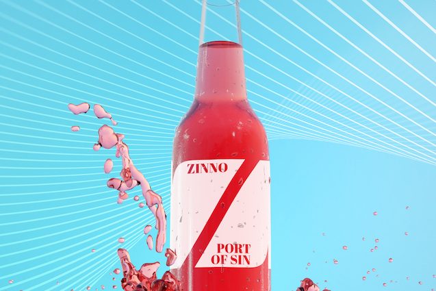
ZINNO
ZINNO PORT OF SIN Porto, Portugal LABEL DESIGN We created the label of Zinno Port of Sin playing with negative...
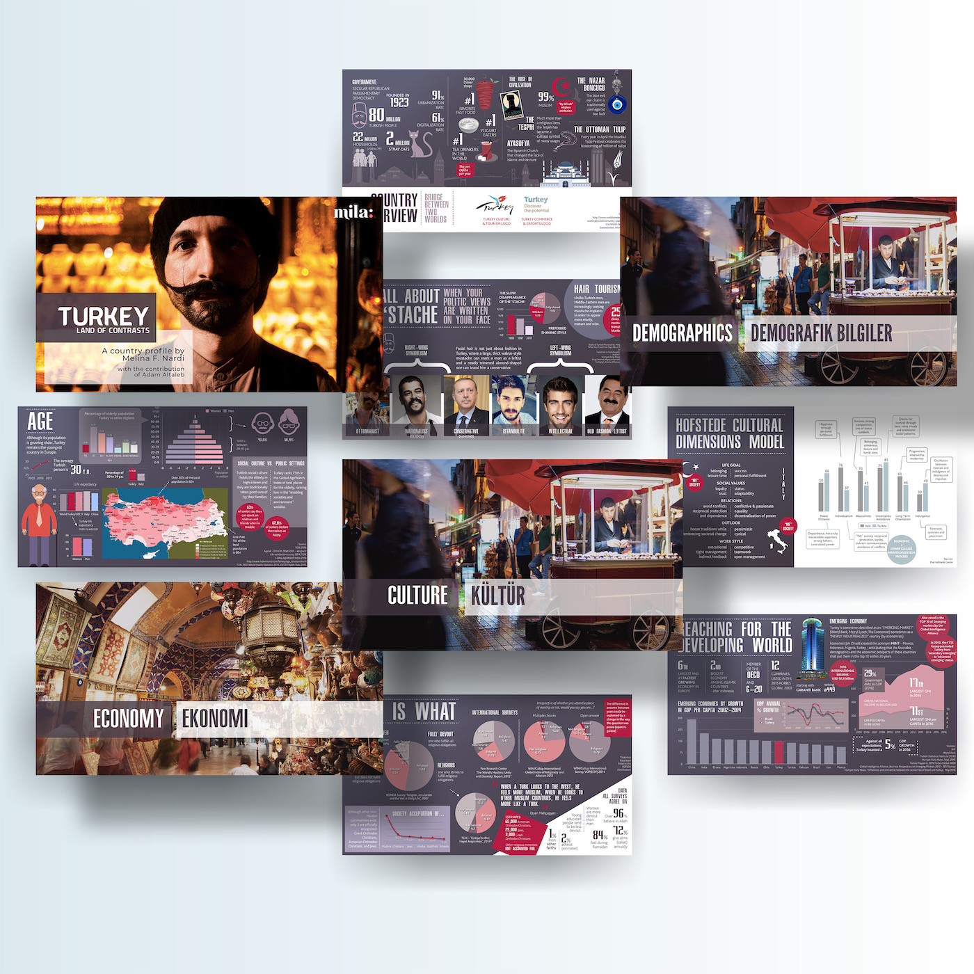
TURKEY PROFILE
TURKEY PROFILE Istanbul, Turkey A 360º COUNTRY PROFILE OF TURKEY The turkey profile is an exhaustive compilation of qualitative and...
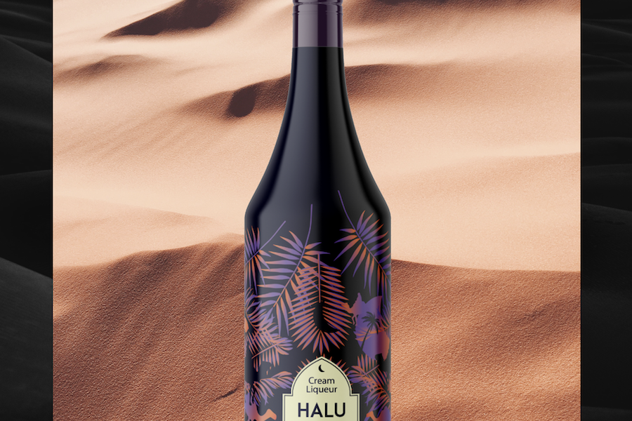
HALU LIQUOR
HALU Abu Dhabi, United Arab Emirates LIQUOR LABEL DESIGN From the sand dunes of Abu Dhabi, we received this request...
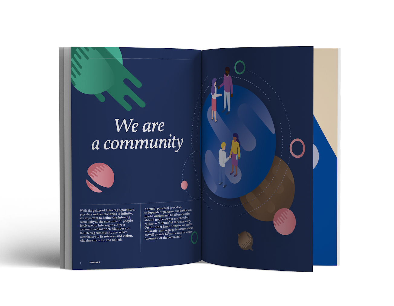
INTERREG
INTERREG Brussels, Belgium BRAND STRATEGY & MANUAL As one of the main funding programmes of the European Union, Interreg operates...
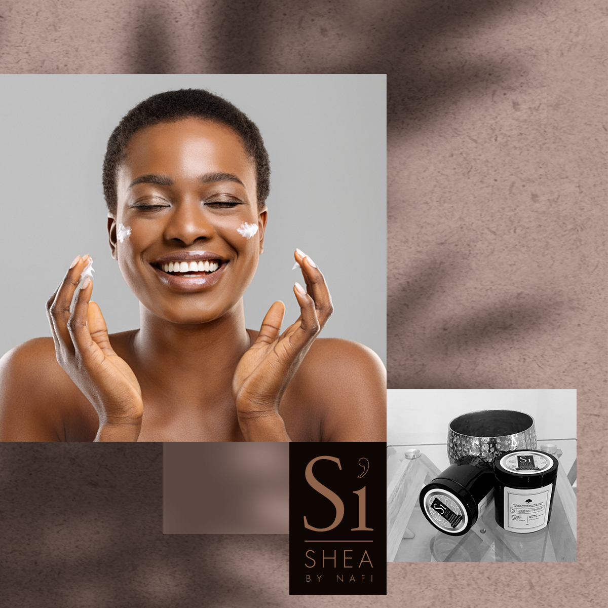
S’I SHEA COSMETICS
S'I SHEA COSMETICS Dakar, Senegal LABEL DESIGN & SOCIAL MEDIA MANAGEMENT Based in Senegal, Si Shea is a brand of...
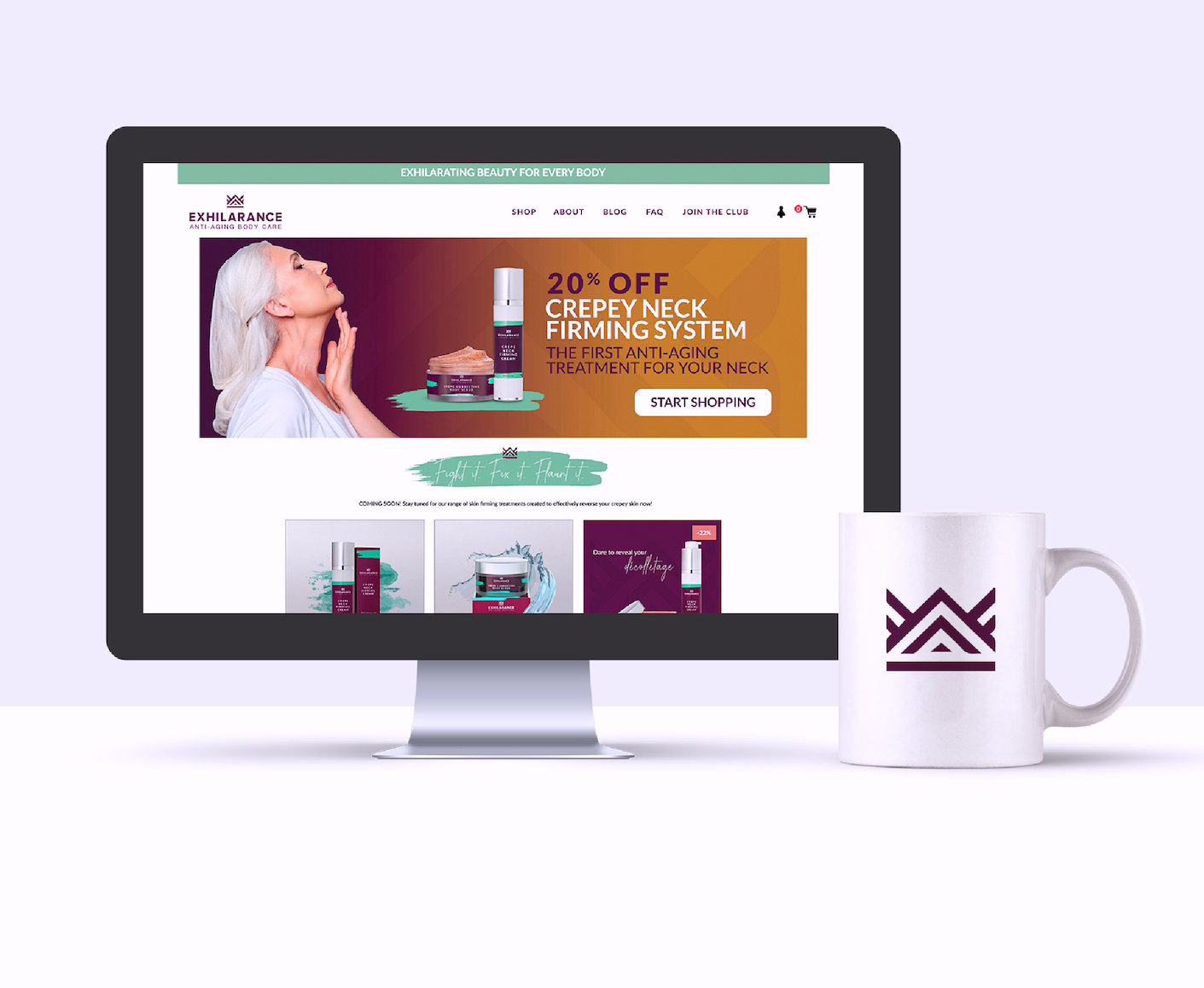
EXHILARANCE COSMETICS
EXHILARANCE Rheinfelden, Switzerland FULL BRAND DEVELOPMENT Exhilarance is a brand new line of anti-aging cosmetics dedicated to the body. While...
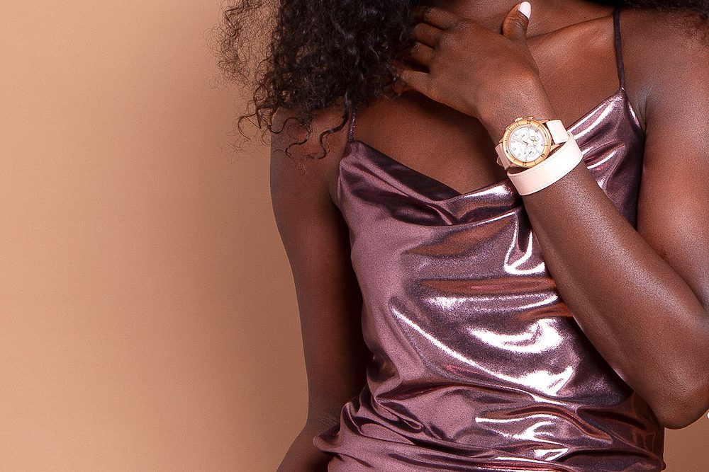
CODE EVE WATCHES
CODE EVE Geneva, Switzerland FULL NEW BRAND DEVELOPMENT After years working for Swiss watchmakers, David R. decided to found Code...
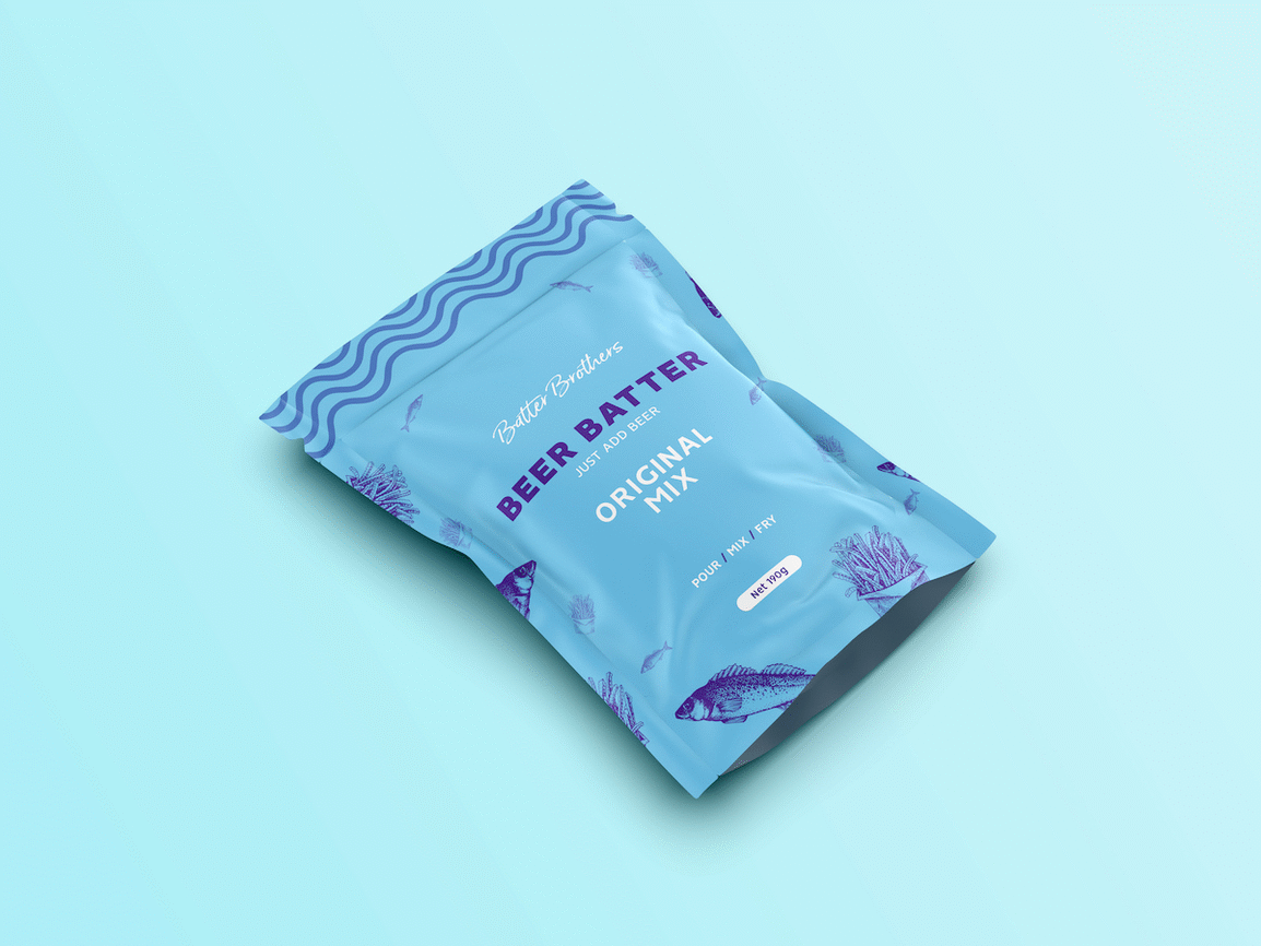
BATTER BROTHERS
BATTER BROTHERS New Zealand PACKAGING DESIGN Based in New Zealand, Batter Brothers is a batter mix made from beer being...
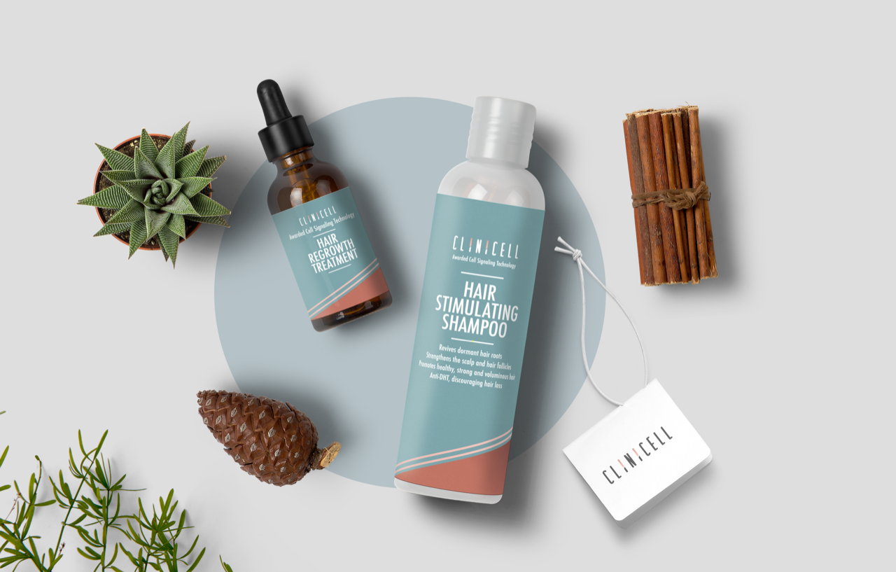
CLINICELL Clinical Cosmetics
CLINICELL Hong Kong BRAND IDENTITY FOR A NEW PRODUCT LAUNCH Clinicell is a line of clinical cosmetic products by LifeHub...
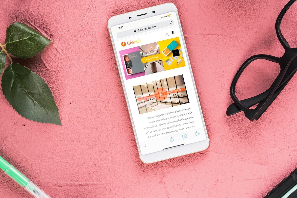
LIFEHUB Wellness center
LIFEHUB Hong Kong E-COMMERCE, PRINTS & MERCHANDISING LifeHub is a wellness center located in the heart of Hong Kong, they...

IPAY FOL
IPAY FOL Izmir, Turkey BRAND STRATEGY BRANDING AND LAUNCH OF A NEW FMCG PRODUCT IN COLLABORATION WITH DS ENTEGRE IPAY,...